Bee Production
A concept brand identity study for the creative and production industries — an experiment in an energetic, memorable, and scalable visual system.
TECHNOLOGIES USED
PROJECT GALLERY
Project Purpose
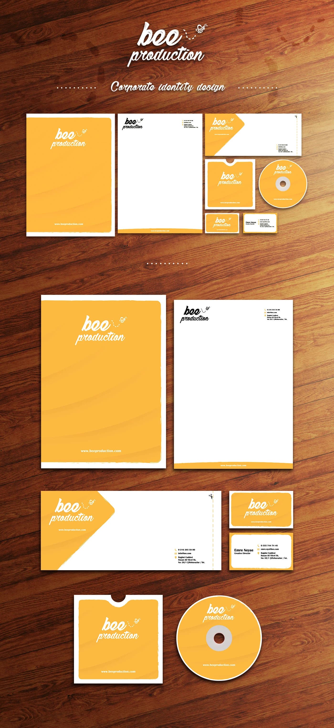
This is not a real brand project born from a commercial need; it is a case study I built from scratch to showcase my skills in corporate identity design, color psychology, and visual hierarchy. The core goal was to design a holistic brand system that reflects the energy and professionalism a creative production agency would need.
Design Strategy and Solution
During the design process, I centered the productivity, speed, and dynamism inherent in the name "Bee." In line with the sector's structure, I combined the energetic tones of yellow with the strong contrast of black. Going beyond designing a logo alone, I built a modular visual language that works seamlessly in both digital and print materials — from letterhead to corporate folders and presentation templates.
Outcome
A modern, attention-grabbing identity practice emerged that shows how a brand story can be built visually from scratch and adapted systematically to corporate materials.