Dünya Göz
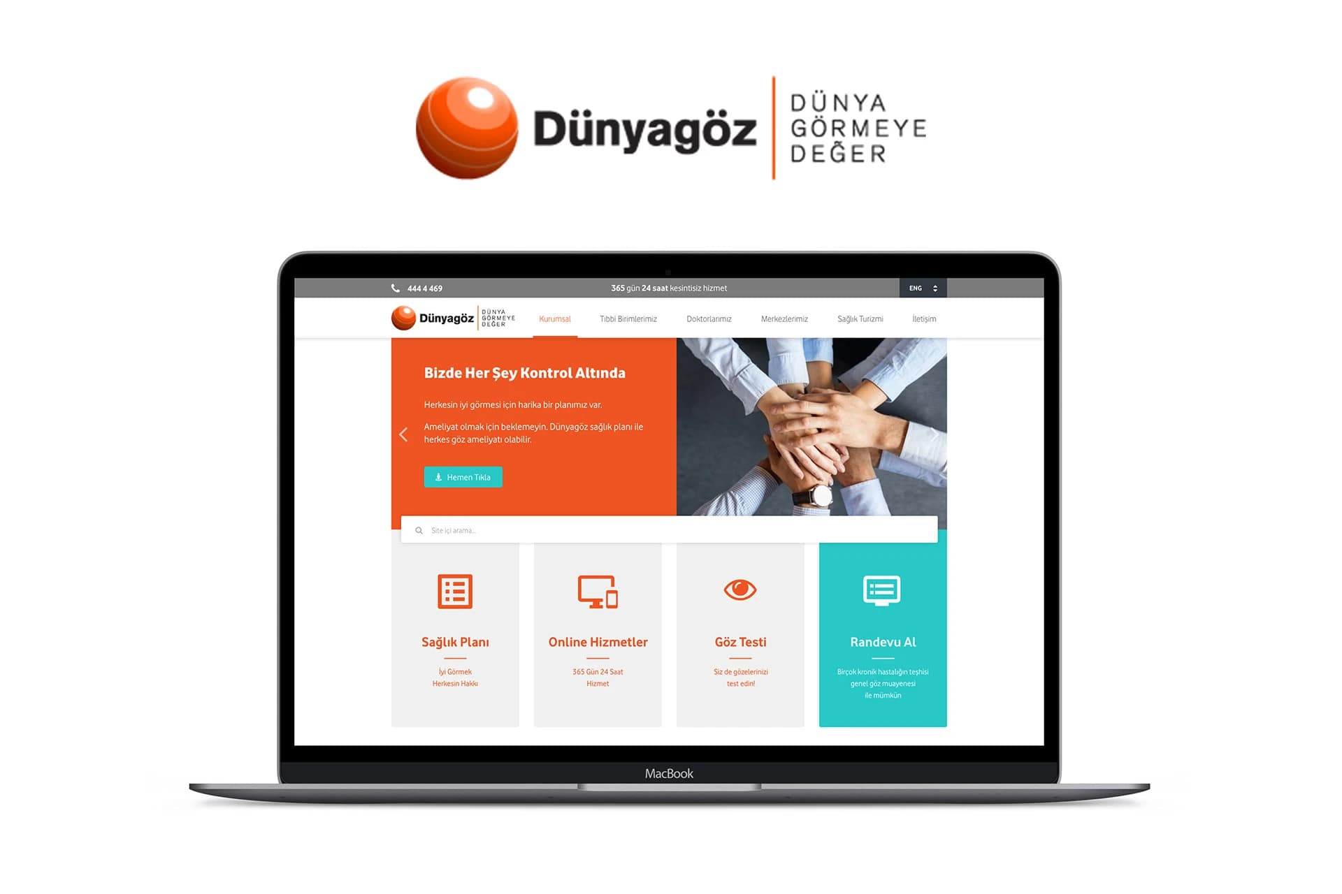
A healthcare interface design where I simplified the appointment booking process and redesigned the Medical Departments experience.
TECHNOLOGIES USED
PROJECT GALLERY
Purpose
I identified two core usability issues in Dünya Göz's existing interface: the appointment booking button did not stand out enough in the visual hierarchy, making it hard for users to find on the page. In addition, the Medical Departments section had a complex information architecture; navigating between specialties and finding the right department created unnecessary cognitive load. The goal of this study was to develop an interface structure that lets prospective patients complete the two most critical actions—booking an appointment and finding the right specialty—with minimal friction.
Process
I ran the work in five steps:
- Competitive/Benchmark Analysis – I reviewed appointment and department/specialty discovery flows at similar healthcare organizations to identify strong and weak practices.
- User Flow Mapping – I mapped the current path from site entry to completed appointment and clarified friction points, especially the visibility of the appointment CTA and the complexity of department selection.
- Wireframing – I created low-fidelity page skeletons to address the identified issues and reorganized the information architecture and page hierarchy.
- UI Kit / Design System – I built a component library (buttons, cards, navigation, etc.) for a consistent visual language so critical elements such as the appointment CTA could be systematically emphasized.
- Prototyping – I prepared a high-fidelity, interactive prototype to make the end-to-end flow testable.
Outcome
Three concrete improvements emerged from this process:
- Simplified appointment flow – The appointment button was prioritized in the visual hierarchy and the flow was reduced to fewer steps.
- Improved doctor/specialty discovery – The Medical Departments section was restructured so users could reach the specialty they needed with fewer clicks and clearer categorization.
- Mobile-first design – The interface was reworked with mobile use as the priority to deliver a consistent, accessible experience across screen sizes.